


Studio: Paul Belford Ltd
Team: Paul Belford, Eleanor Robertson, Polina Hohonova
Credits: Brand Consultancy, Liz Norris; Photography, Laurence Haskell, Kat Volkova; Marbled Papers, Rachel Maiden
Date: 2019
When the first Busaba restaurant opened in Soho in 1999, it introduced Londoners to exciting new Thai flavours. Led by renowned restaurateur Alan Yau, it was radical and bold, with inspiring food and modern design.
After two decades, however, the midmarket sector was facing new challenges and these were affecting Busaba’s business too. The group sought a new brand strategy and identity to help it survive in London’s competitive restaurant scene.
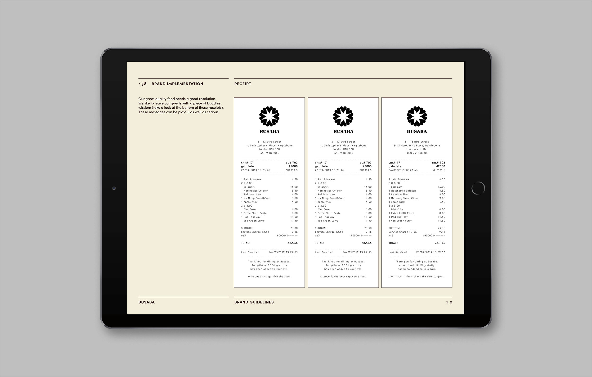
The rebrand coincided with Busaba’s 20th anniversary and was part of a drive to reenergise the brand while celebrating its 20-year legacy. The brief was to create an identity rich in meaning, reflecting Busaba’s founding Buddhist philosophy.
This needed to be executed in a way that would communicate confidence, help to differentiate Busaba from other casual dining operators and highlight brand relevance for modern audiences.
The first phase of the rebrand was the creation of a new brand strategy, encapsulating Busaba’s brand purpose in the phrase ‘happiness and harmony’.
This idea was articulated through a new set of brand values, which informed a 200-word manifesto, directed brand positioning and influenced the next stage of creative development.
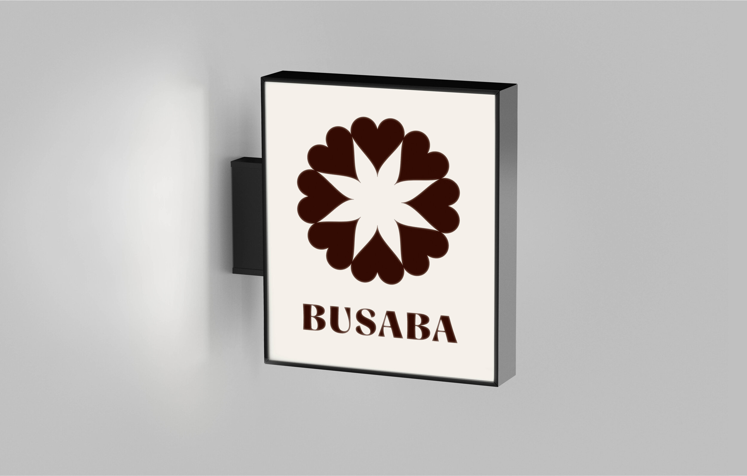
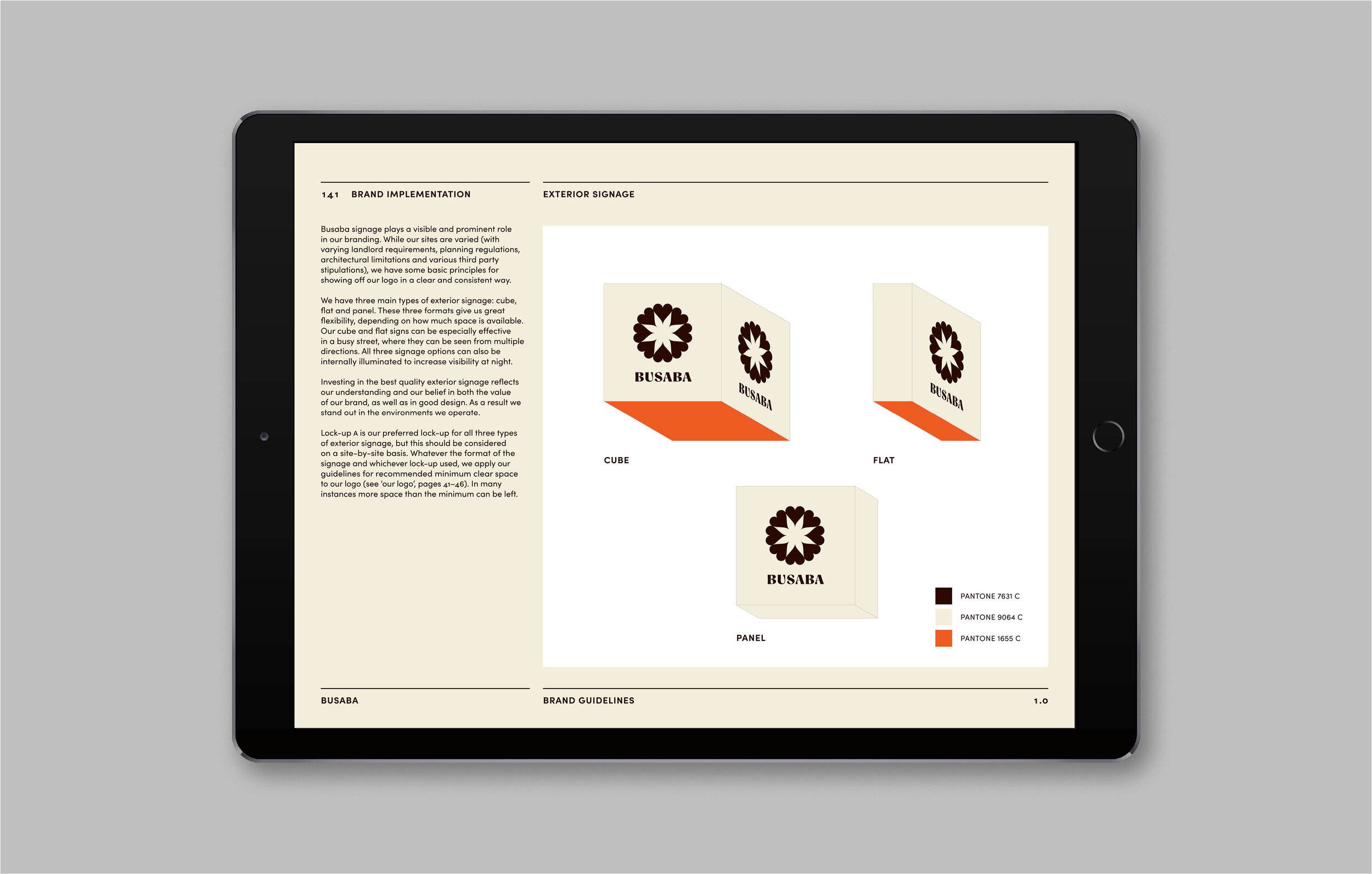
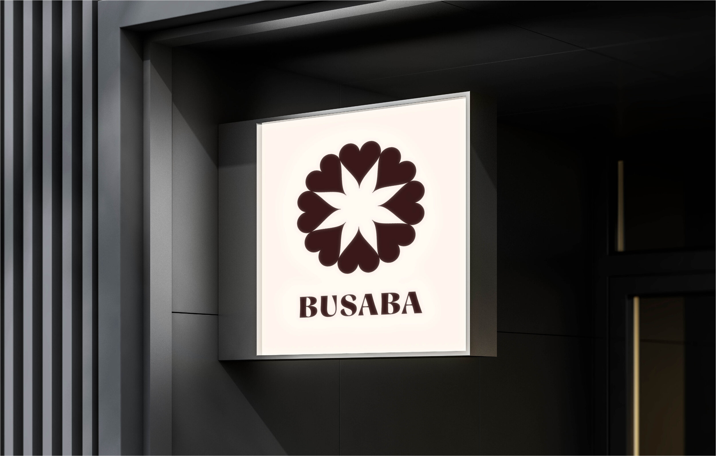
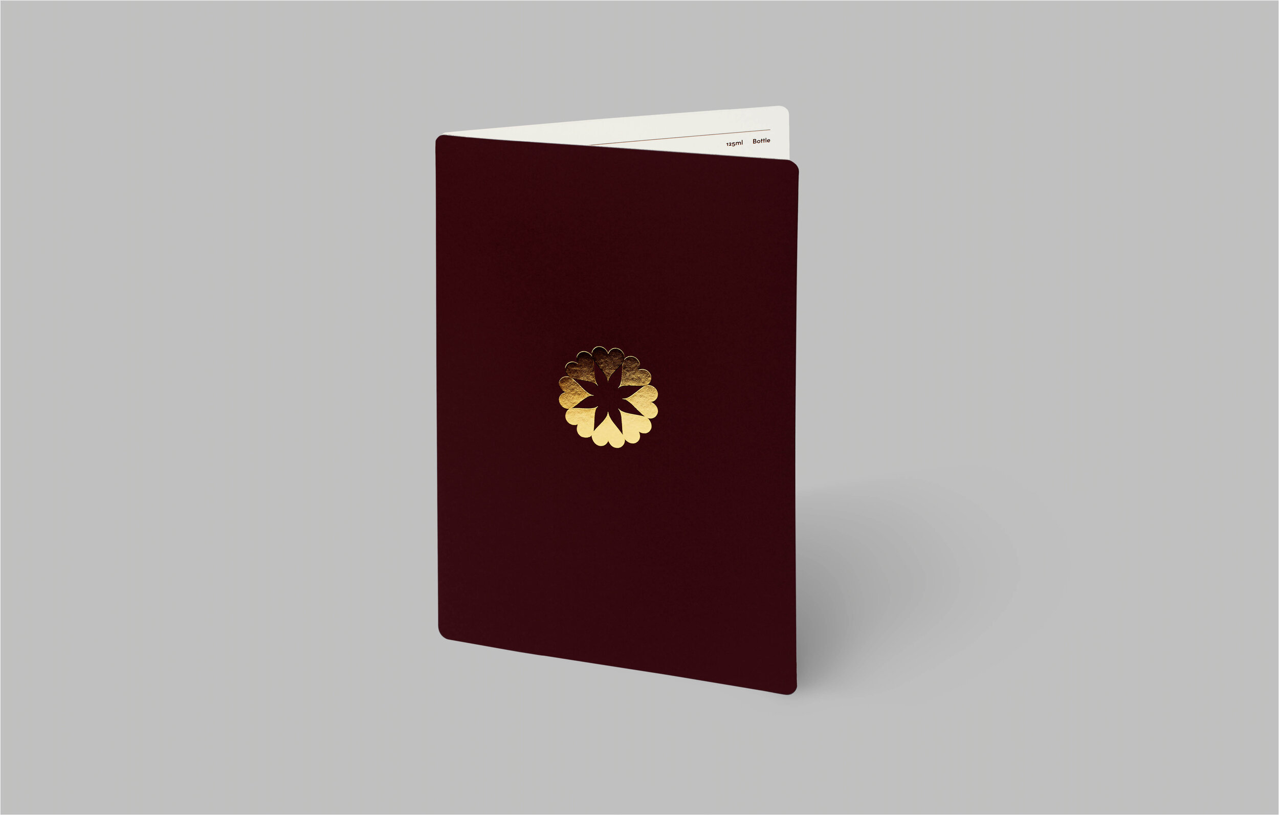
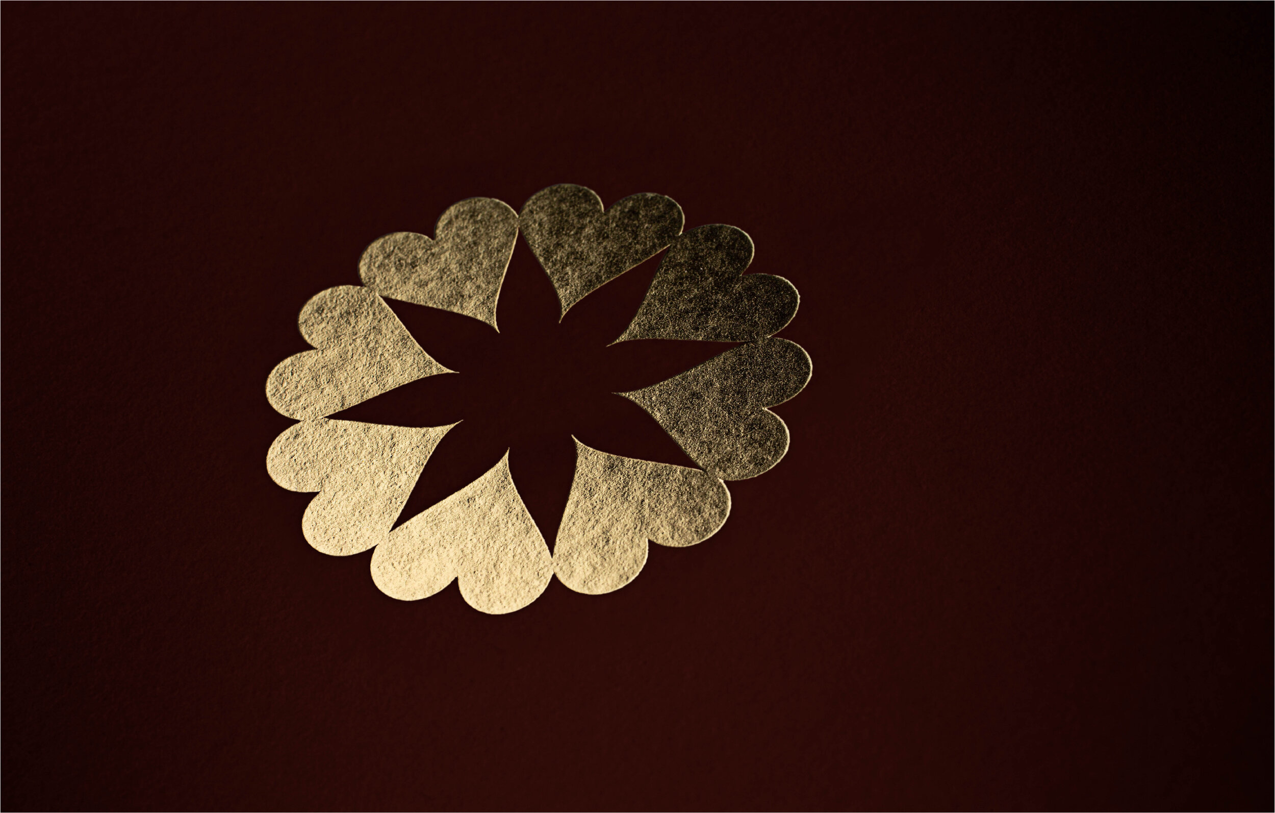
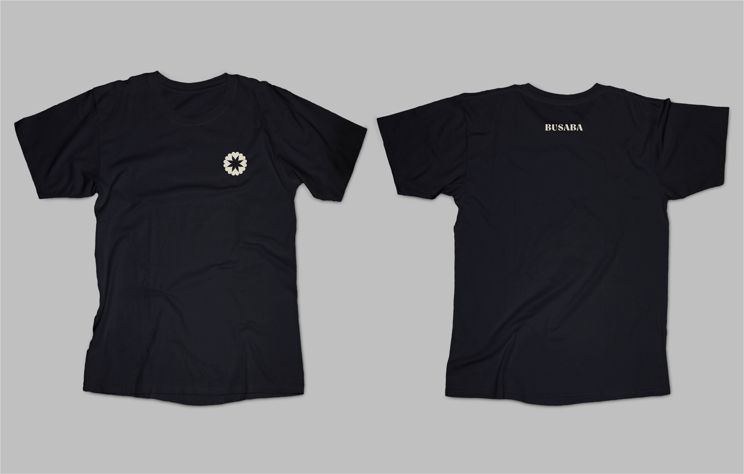
The new logo represents a flower, alluding to the fact that ‘Busaba’ can mean ‘flower’ in Thai. It also references the shape of the gerbera flowers that greet guests in every restaurant. In Buddhist teaching, these symbolise impermanence and serve as reminder to live in the present moment.
The petals of the flower logo are heart-shaped, drawing on two of the important philosophies that inform Busaba’s culture: ‘sookjai’ and ‘namjai’. ‘Sookjai’, meaning ‘happy heart’, has similarities to the Western idea of mindfulness. Meanwhile the principle of ‘namjai’ — or ‘water of the heart’ — encourages taking pleasure in acts of hospitality.
The new brand colours are equally meaningful, referencing the native palette of the restaurants. A deep chocolate called ‘teak’ draws on Busaba’s distinctive dark wood interiors while a warm ‘gold’ foil echoes the atmospheric lighting and brass details. These are complemented by a rich cream called ‘coconut’ and accented by a bright ‘spicy’ orange, a cooler ‘saffron’ and a fresh ‘lime’ green, all inspired by the restaurant’s fragrant dishes.
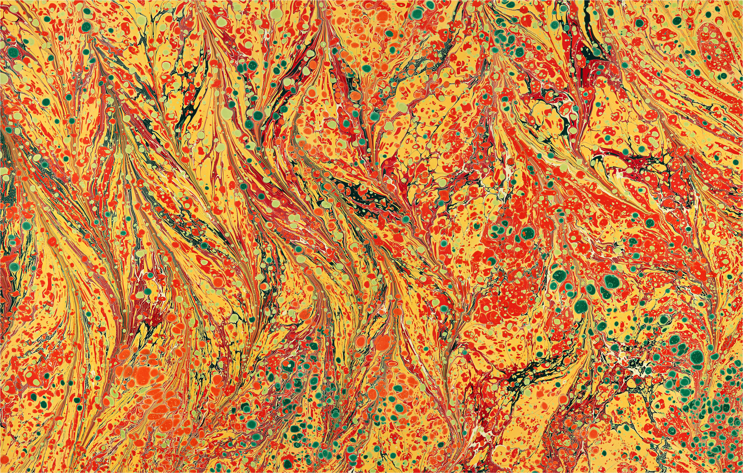
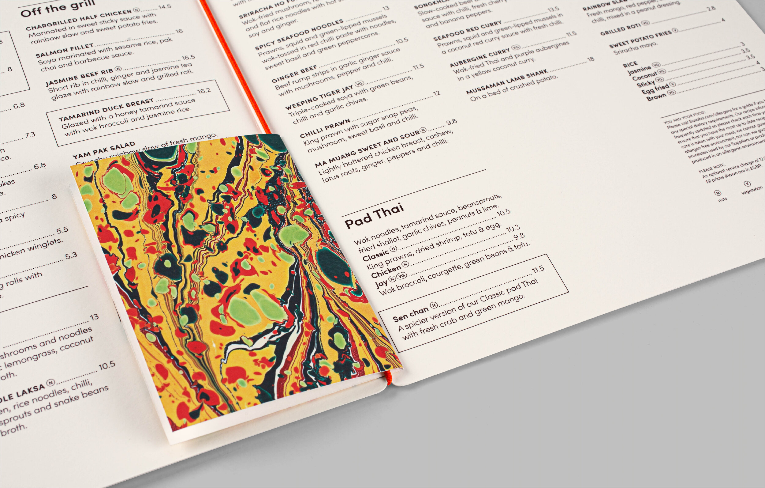
Alongside this colour palette, we introduced a library of patterns that draw similar inspiration from Busaba’s vibrant sauces, visualising the harmonious mix of flavours in Thai cuisine. These feature bespoke marbled papers, produced by artist Rachel Maiden.
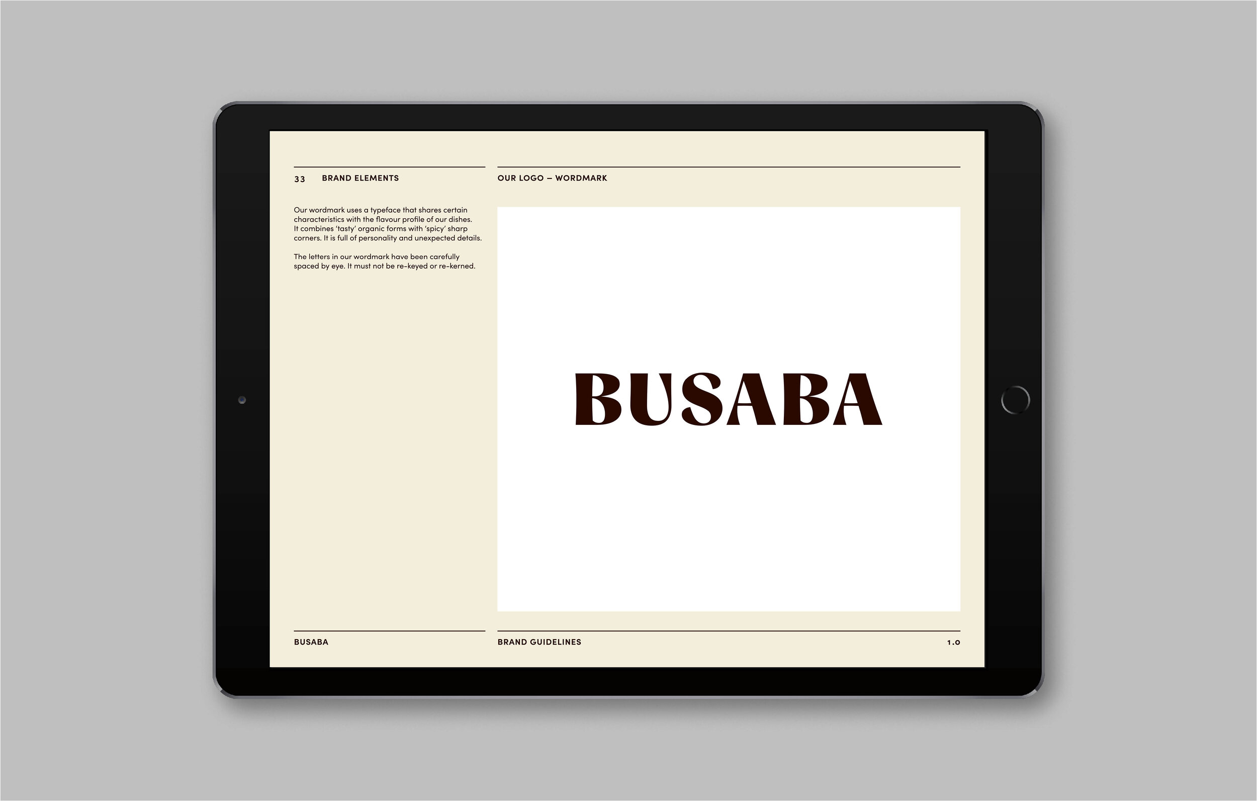
Busaba’s new typeface is Sofia Pro, a clean, modern geometric sans serif with a warm and human feel. Sofia’s rounded curves and open terminals make the font family elegant, friendly and contemporary, and help add personality to brand. We also introduced a complementary Thai script to strengthen the authenticity of the brand.
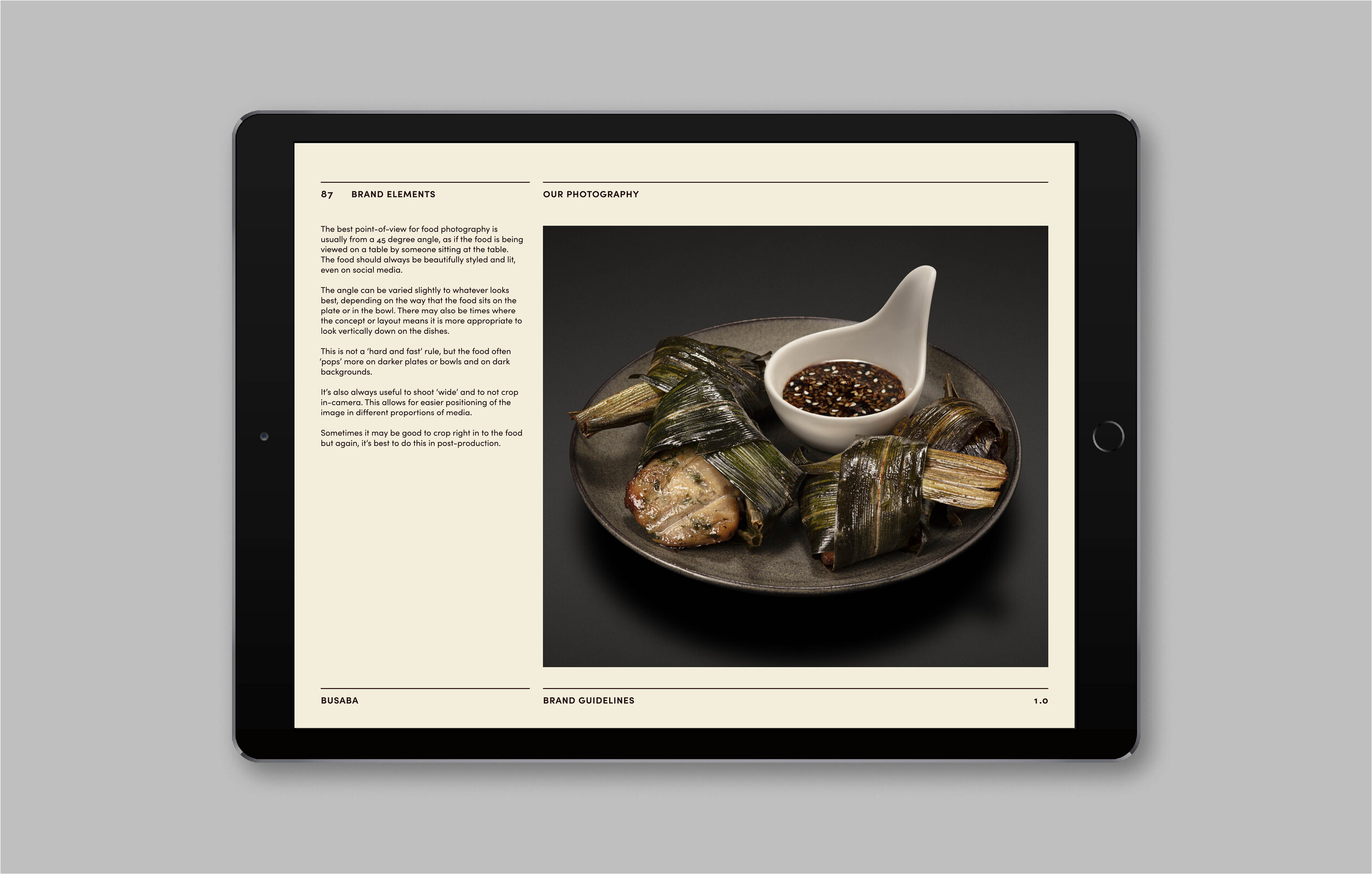
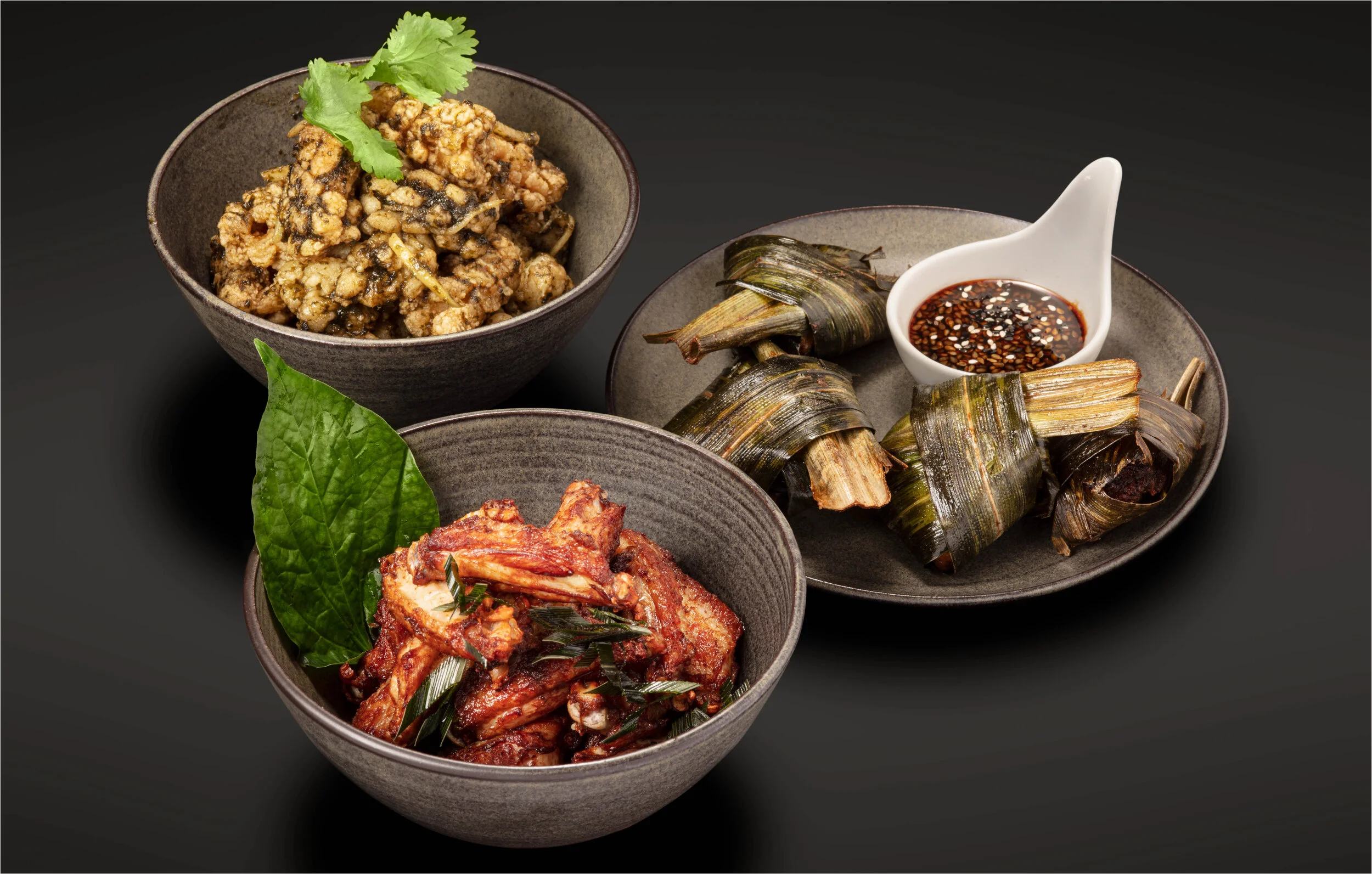
The brand guidelines also include guidance on icons as well as tone of voice, and are accompanied by a new archive of food photography. We chose dark crockery and dark backgrounds for the food photography to help each dish to stand out.
The launch of the rebrand was celebrated with an exterior refresh at the flagship Soho restaurant, with plans to update signage at the 12 remaining sites over the next year. The new identity also included a suite of menus and a new team uniform.
The layout of the menu was based on Harvard University research into eye-tracking and short-term memory capacity. For example, evidence showed that there are seven stages in the reader journey. The most important menu categories should be located in the first two locations, as well as the last. We placed starters and sides in these prime spots to increase the chance of upselling and add on items. Scientific studies also directed the number and order of the dishes in each category (five is optimal).