


Studio: Paul Belford Ltd
Team: Paul Belford, Eleanor Robertson
Credits: Photography, The Public Health Image Library, National Cancer Institute, US Department of Energy, Royal Academy of Engineering
Date: 2020
Life Science People is a specialist recruitment provider for the life science industries, offering services to pharmaceutical, biotech, CRO, medical and healthcare agencies across the UK and Europe.
The brief was to create a fresh and modern brand identity that would still feel timeless and established. The client was keen for the logo to explicitly reference the life sciences. The challenge was to take one of the existing scientific symbols and make it relevant, memorable and — above all — ownable.
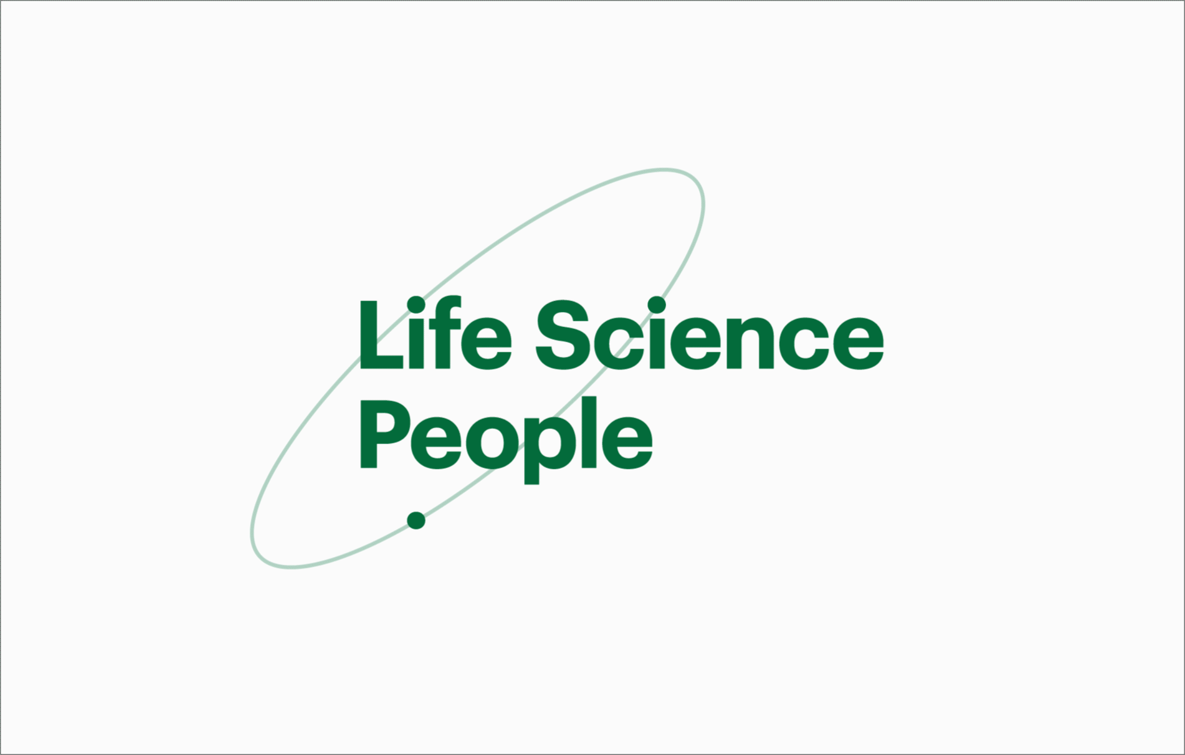
Looking for the graphic gift in the name, we found the dots on lowercase ‘i’s could look like spinning electrons in an atomic diagram. The dots can also represent clients and candidates revolving around the company.
The font family is Graphik, a modern classic inspired by the grotesks and geometric sans serifs of the twentieth century. It is purposefully, elegantly plain and thoughtfully composed.
One of Graphik’s distinctive features is the circular dot on the letter ‘i’, which is unusual for a neo-grotesk typeface. This detail adds a friendly warmth to the brand language.
The life sciences involve the study of life and organisms. Green is the colour of life and also has a strong association with biology and pharmaceuticals. It is the primary brand colour, supported by black.
Since the start-up’s budget for professional, original photography was limited we built an archive of brand imagery using stock photos from archives including The Public Health Image Library, the National Cancer Institute, the US Department of Energy and the Royal Academy of Engineering.
We chose tight crops and applied high contrast adjustments to create strong graphic impact. We also added colour treatments to create visual consistency and to make the images an ownable part of the brand.