

Studio: Freelance
Team: Eleanor Robertson
Credits: —
Date: 2019
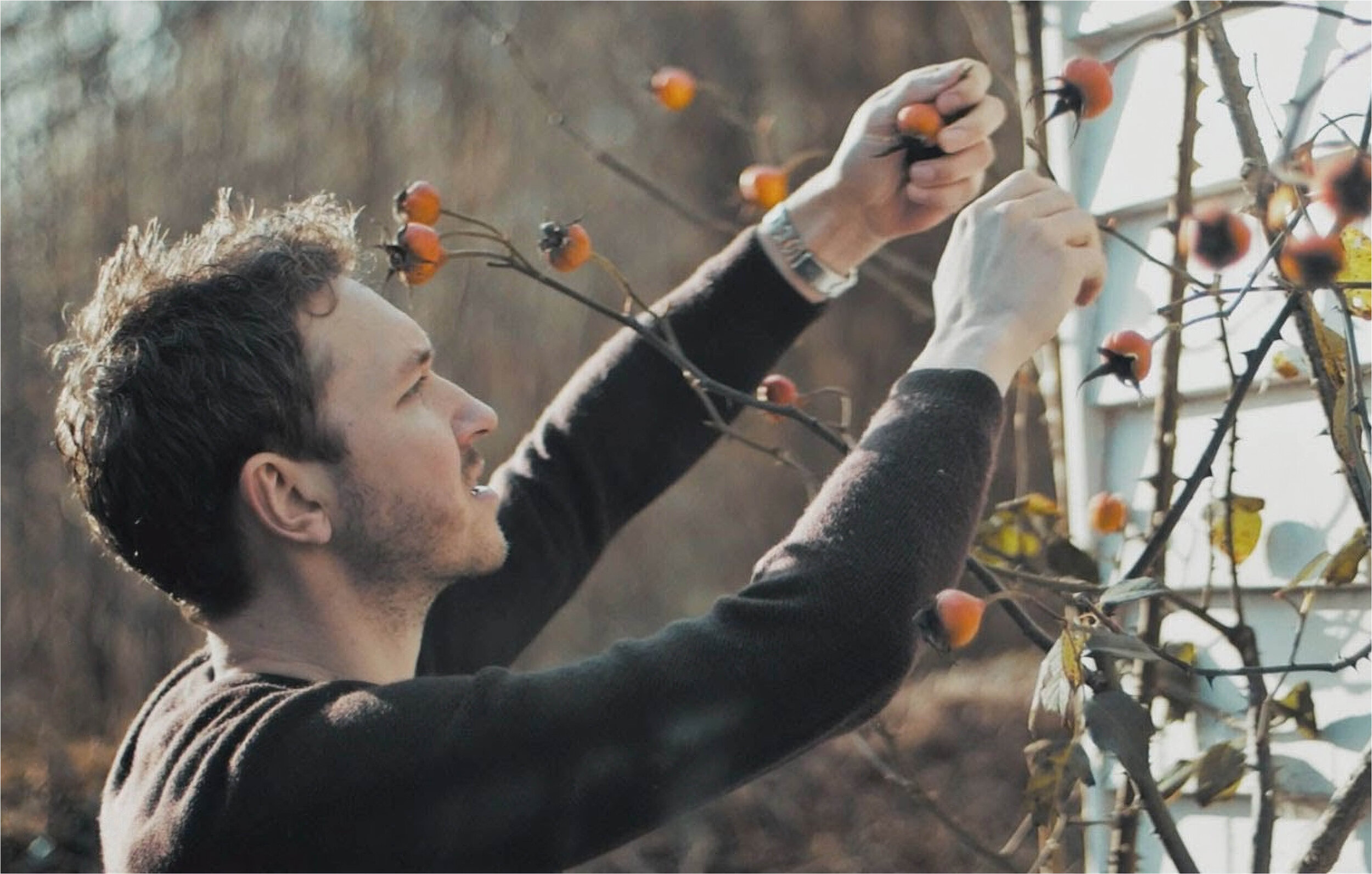
Sael Projects was founded by chef and food researcher Tobyn Excell to explore society’s relationship with nature through food. Activities include monthly supper clubs, educational workshops and foraging events. These are focused on sustainable methods of food cultivation and natural preparation processes.
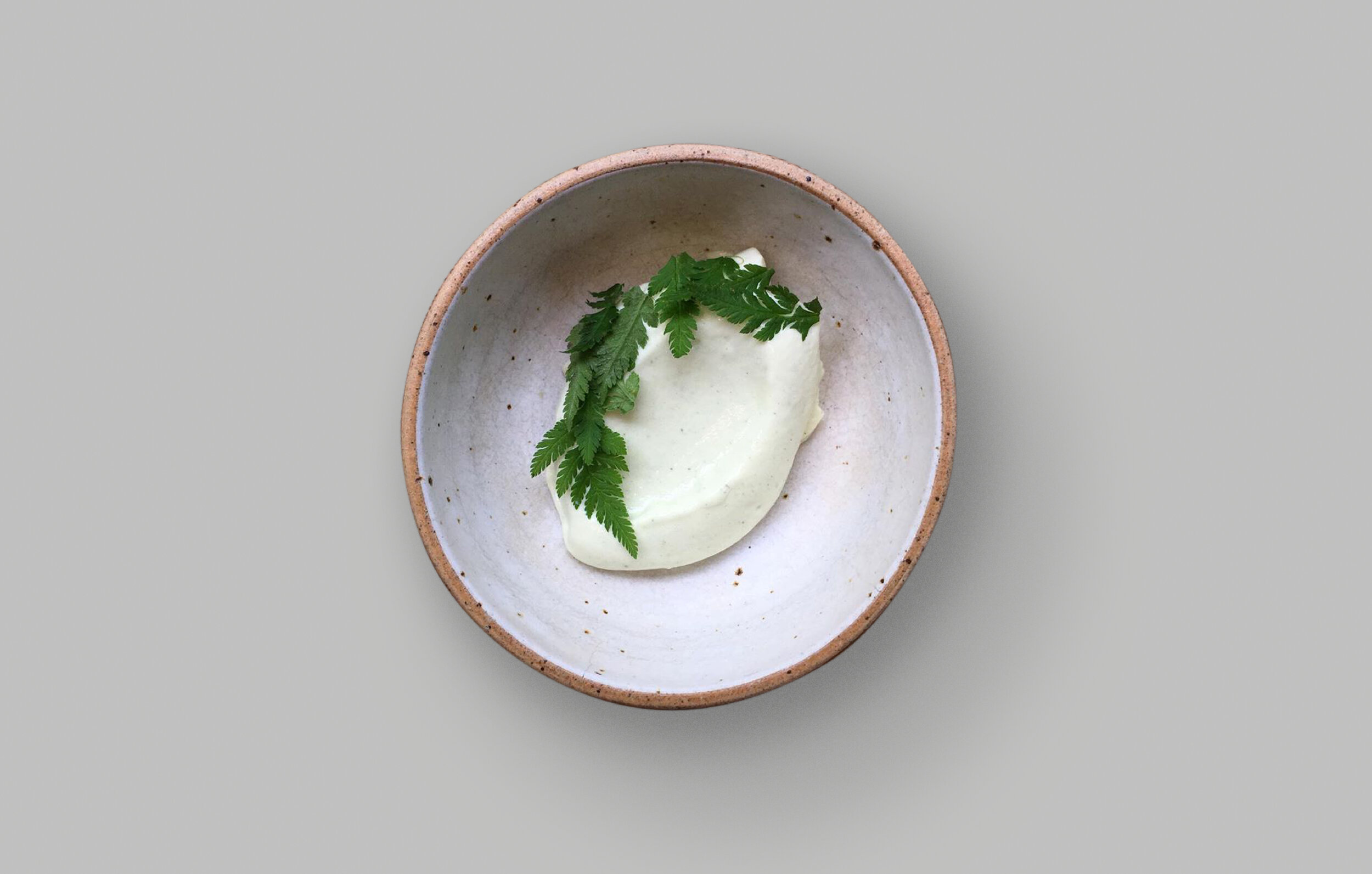
Tobyn’s table is the expression of Sael’s vision, combining ancient and new flavours and techniques and drawing on the wildlife in the local marshes, woods and coastlines. His dishes integrate overlooked wild ingredients and celebrate pre-industrial food production.
The brief was to create a thoughtful identity, reflecting the research and philosophy underpinning Tobyn’s food and taking similar inspiration from the landscape. The aim was to help build a sense of community and shared purpose across a broad range of projects, including pop-ups and partnerships.
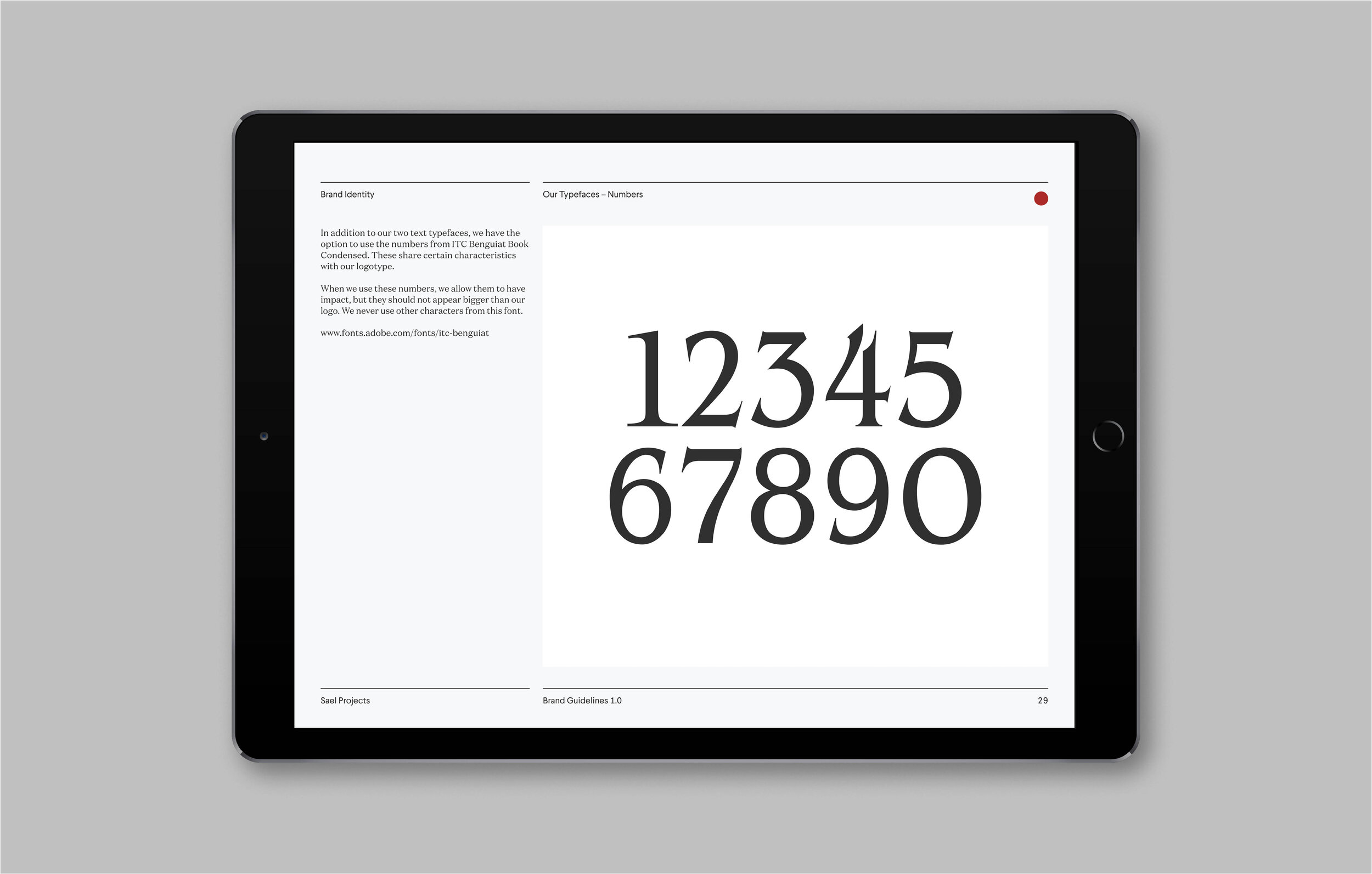
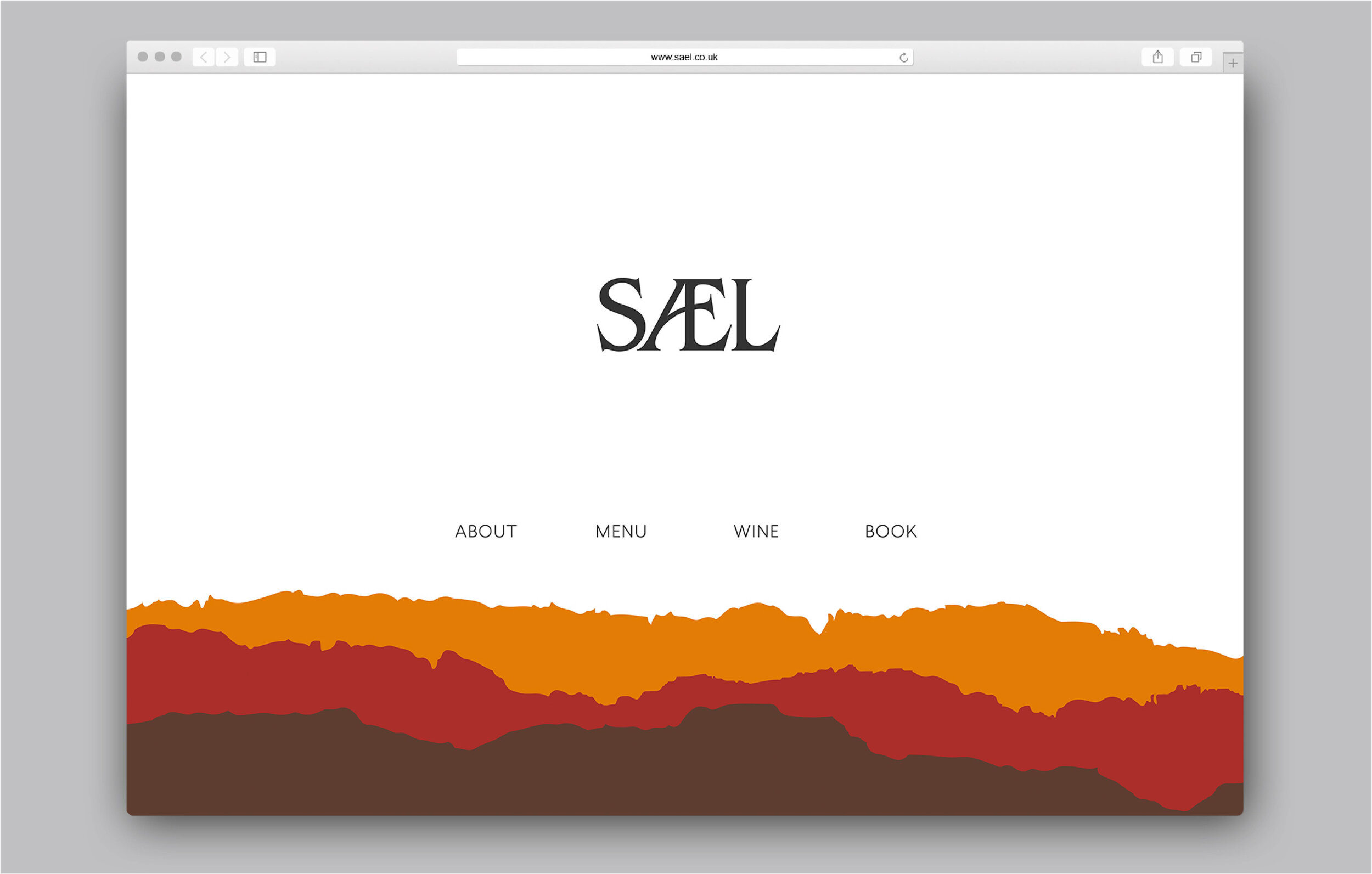
The Old English word Sael has had many meanings – one of them is ‘harvest’. It means a time of joy, a time of opportunity, of prosperity, abundance and feasting. Just as Sael Projects looks to the past for inspiration, so the logo draws on the flourishes found in Anglo Saxon writing.
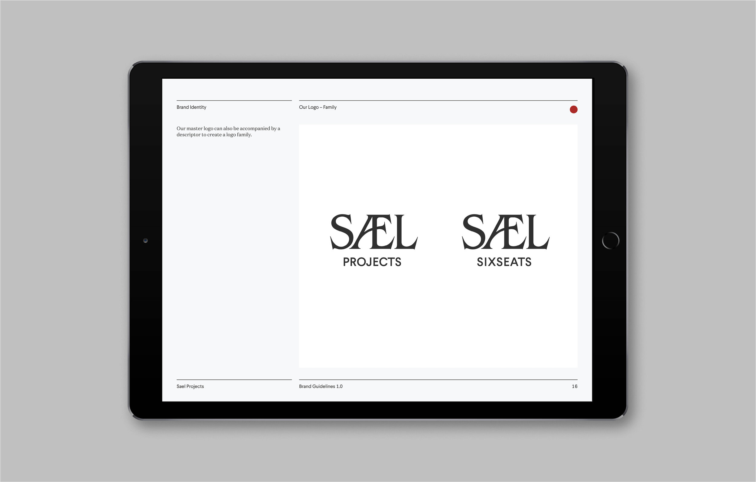
The master logo can also be accompanied by a descriptor to create a logo family, each representing a specific project or event. Where space is limited, a symbol can stand in for the brand logo. This symbol also draws on Anglo Saxon culture: it is based on one of the 24 runes from the futhorc alphabet: ‘ger’, which means ‘year’ or ‘harvest’.
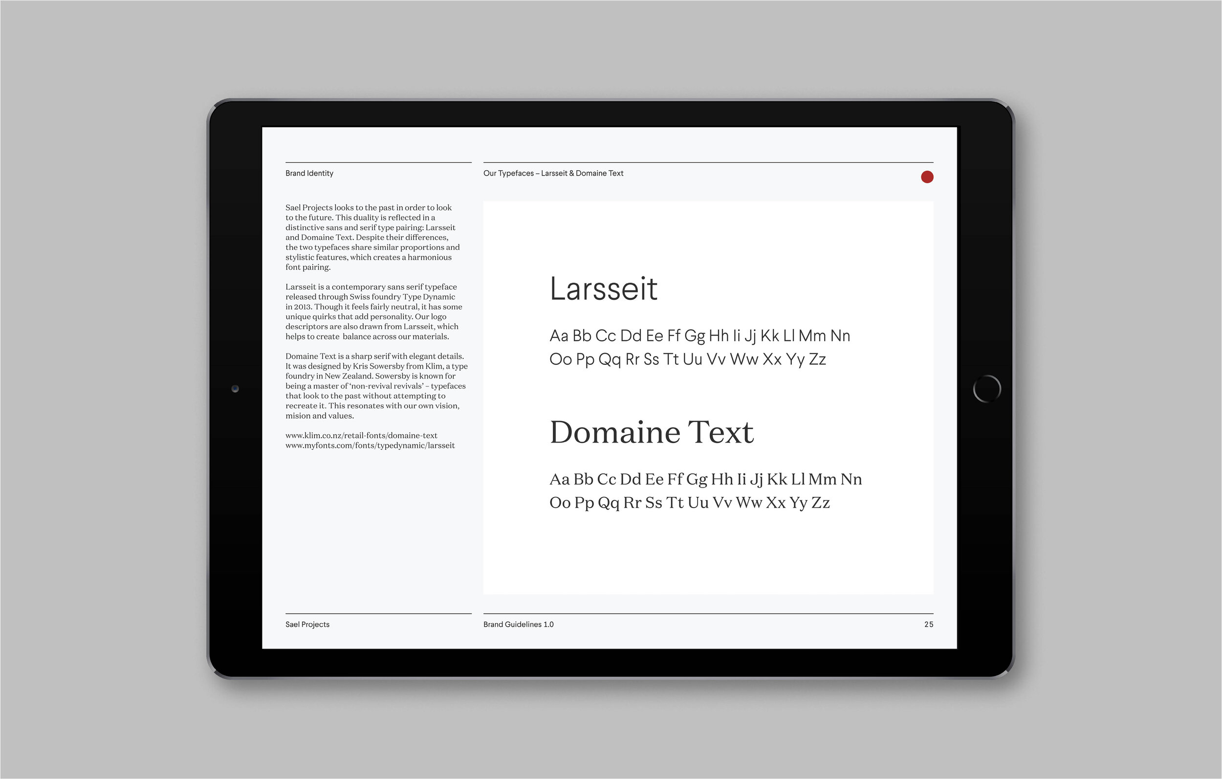
Sael Projects looks to the past in order to look to the future. This duality is reflected in a distinctive sans and serif type pairing: Larsseit and Domaine Text. Despite their differences, the two typefaces share similar proportions and stylistic features, which creates a harmonious balance.
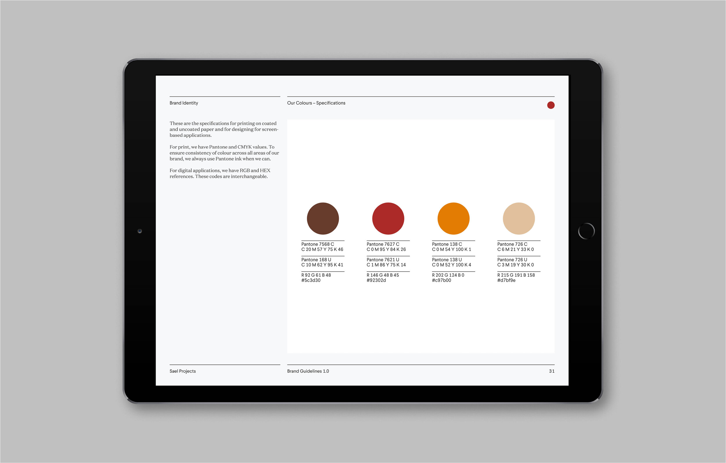
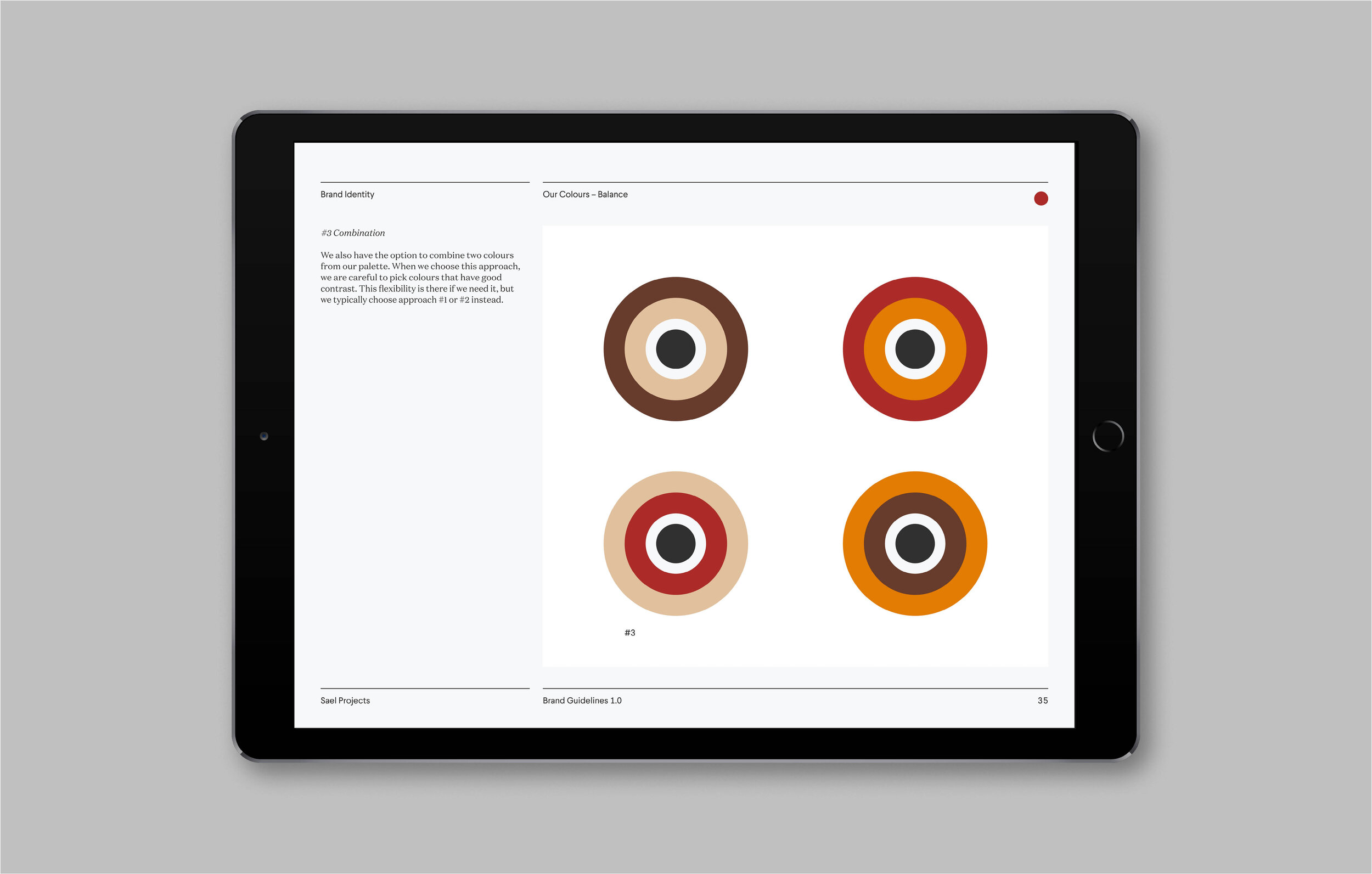
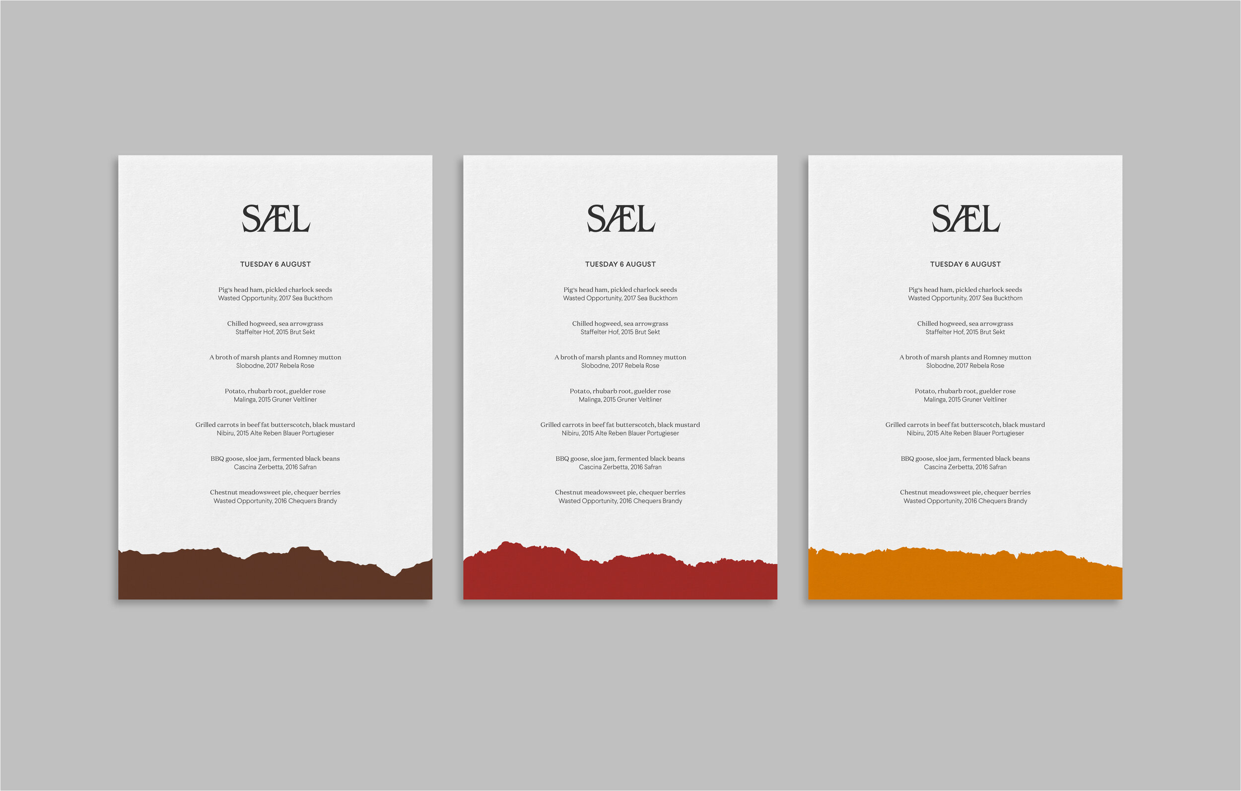
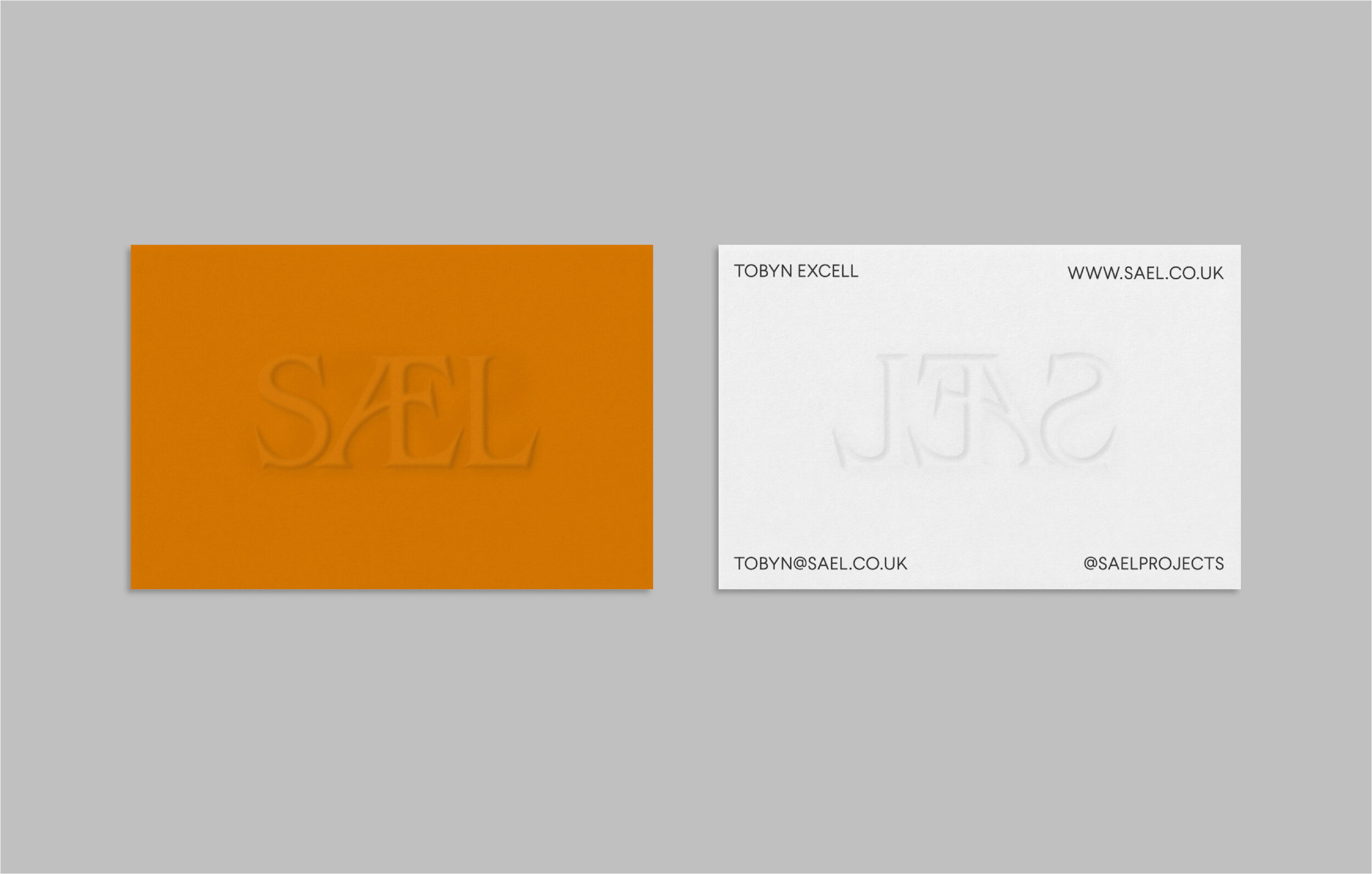
Sael Projects explores the history of the landscape and the palette enacts this too with four colours chosen to represent different soil layers. The palette has a comforting warmth and complexity.
The four colours also correspond to papers from UK paper merchant G. F. Smith’s Colorplan range to create consistency across digital media and printed materials, such as menus, flyers and business cards.
The brand language also includes a library of textures drawn from the colour palette. These suggest soil horizons and represent the many layers of history, knowledge, philosophy and process behind each menu.
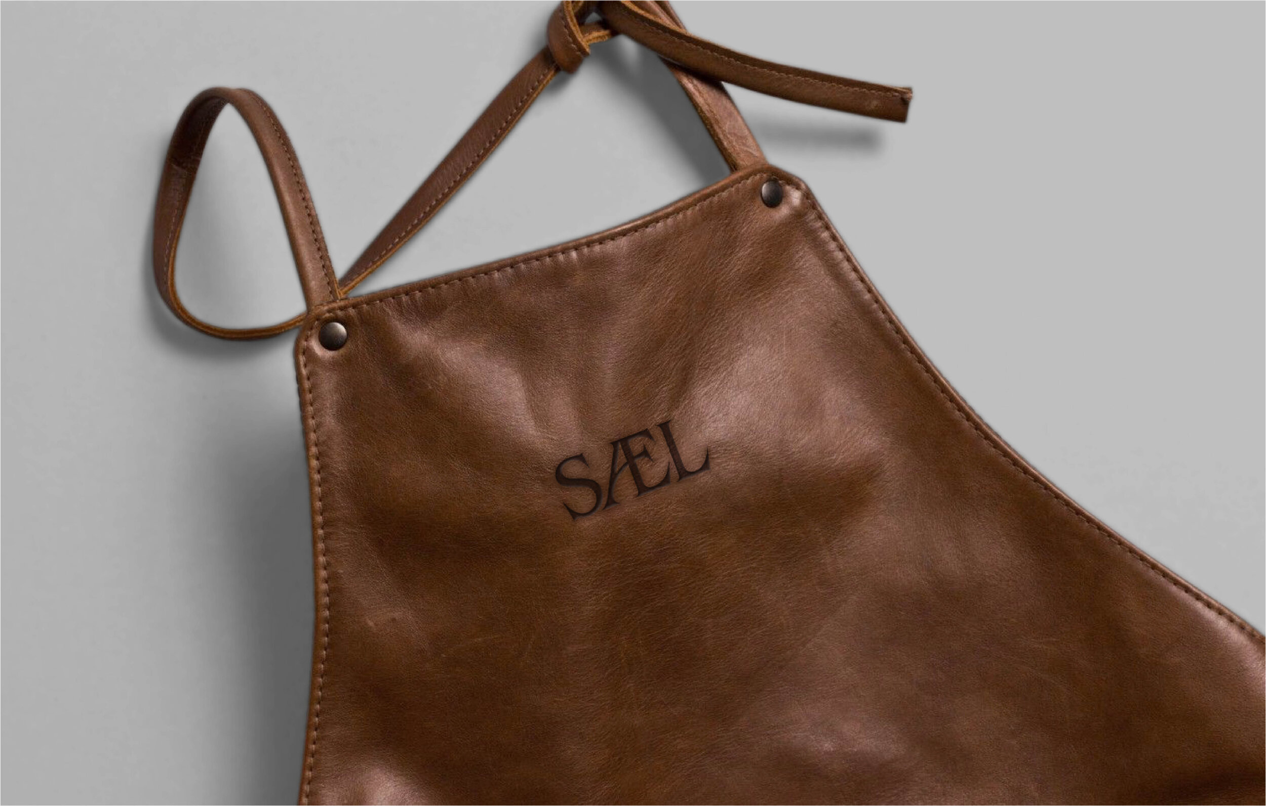
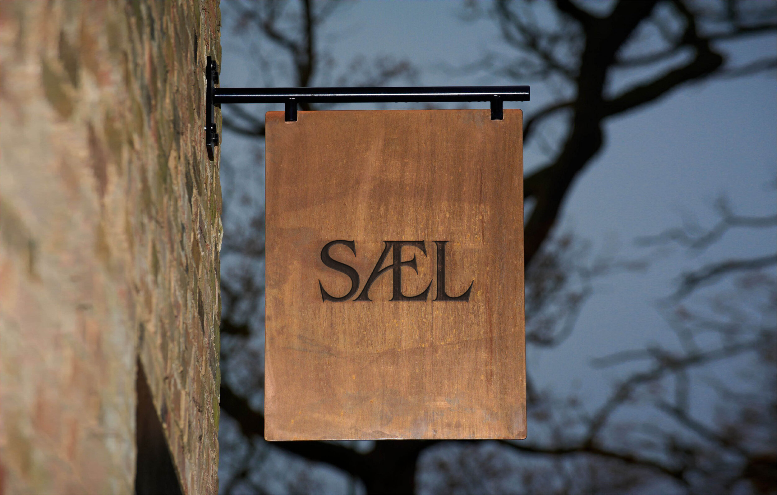
Brand activation introduces natural materials, including paper, leather and wood. It also provides an opportunity to use artisanal processes, such as blind embossing, engraving, die-cutting and carving. These renderings give the brand a tactile and understated sense of craft, reflecting the attention to detail that goes into every dish.